
Color Coordination: Choosing the Best Colors to Complement Wood Panels
Wood wall panels are a timeless addition to any space, adding warmth, texture, and a touch of natural elegance. However, to truly bring out their beauty, it’s essential to coordinate the surrounding colors effectively. Whether your wood panels are natural oak, walnut, or dark oak, the right color palette can transform your space into a harmonious and inviting environment. Here are specific tips for coordinating colors with each of these wood types.
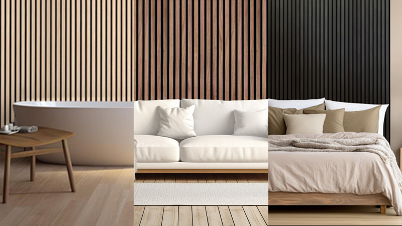
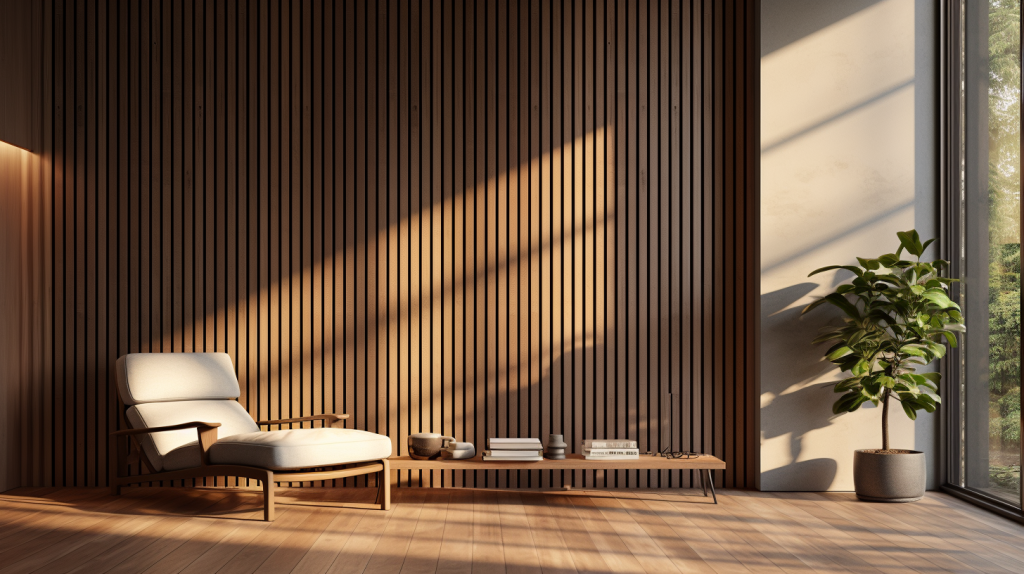
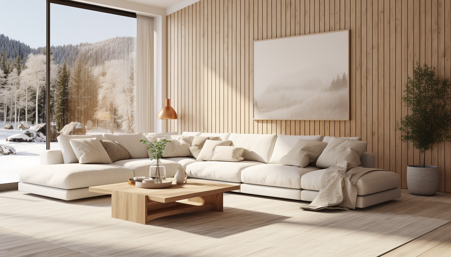
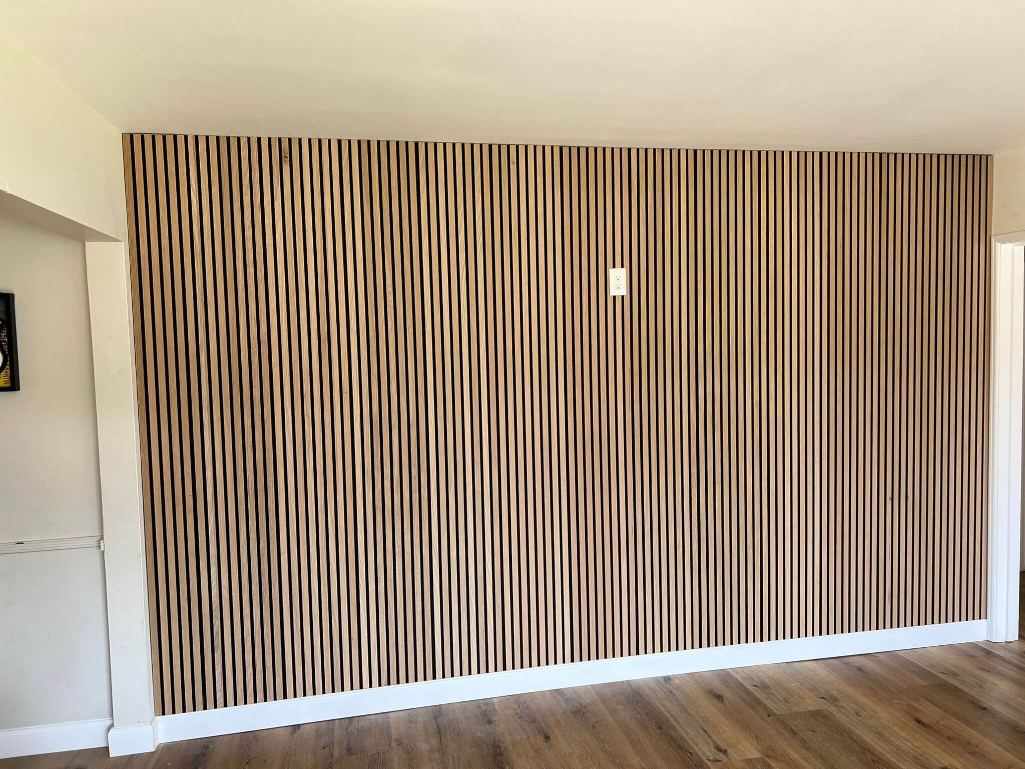
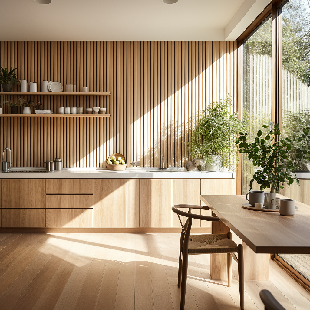
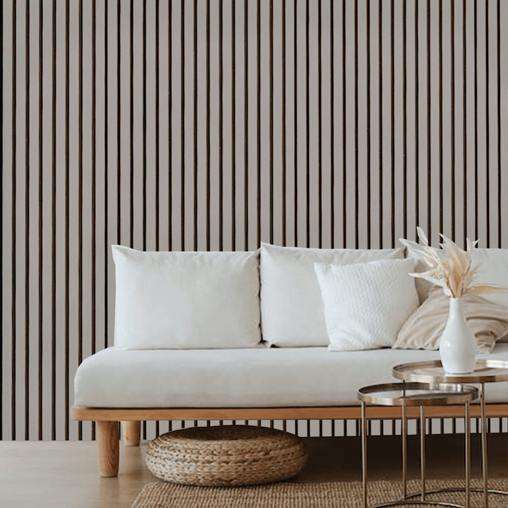
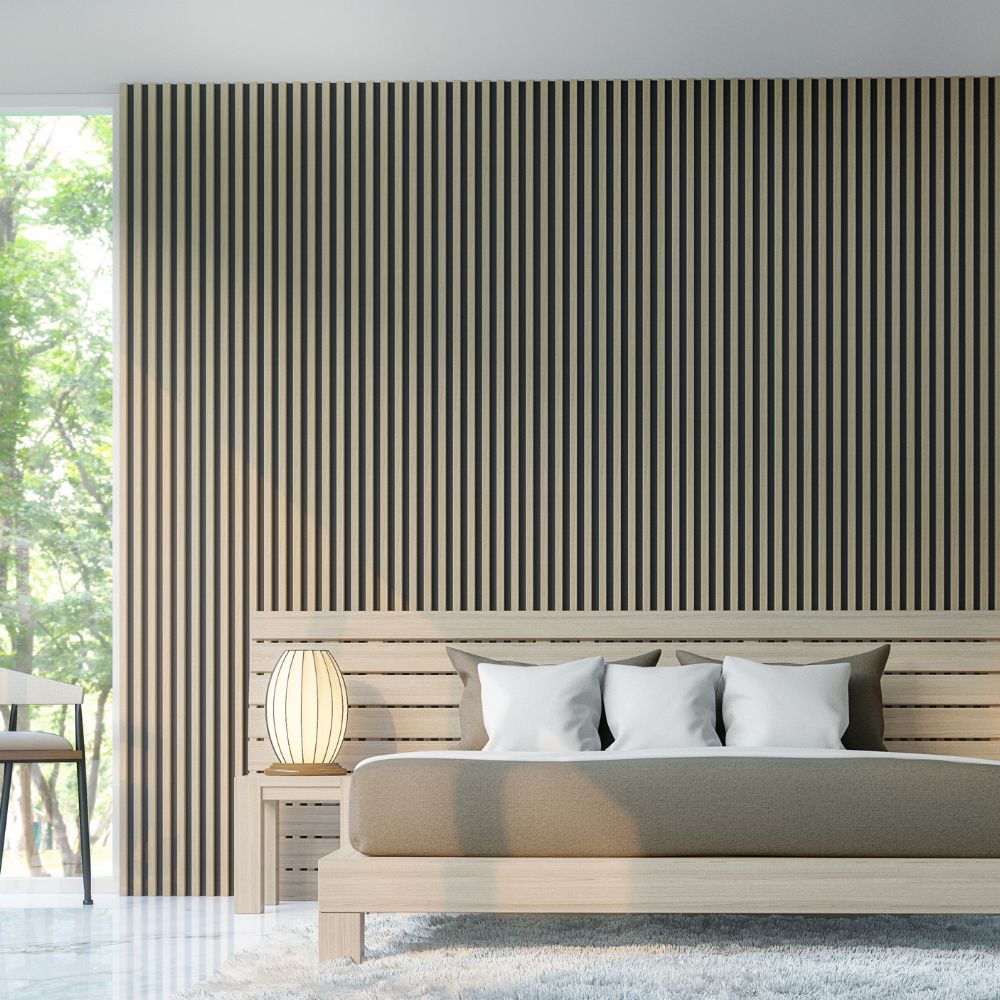
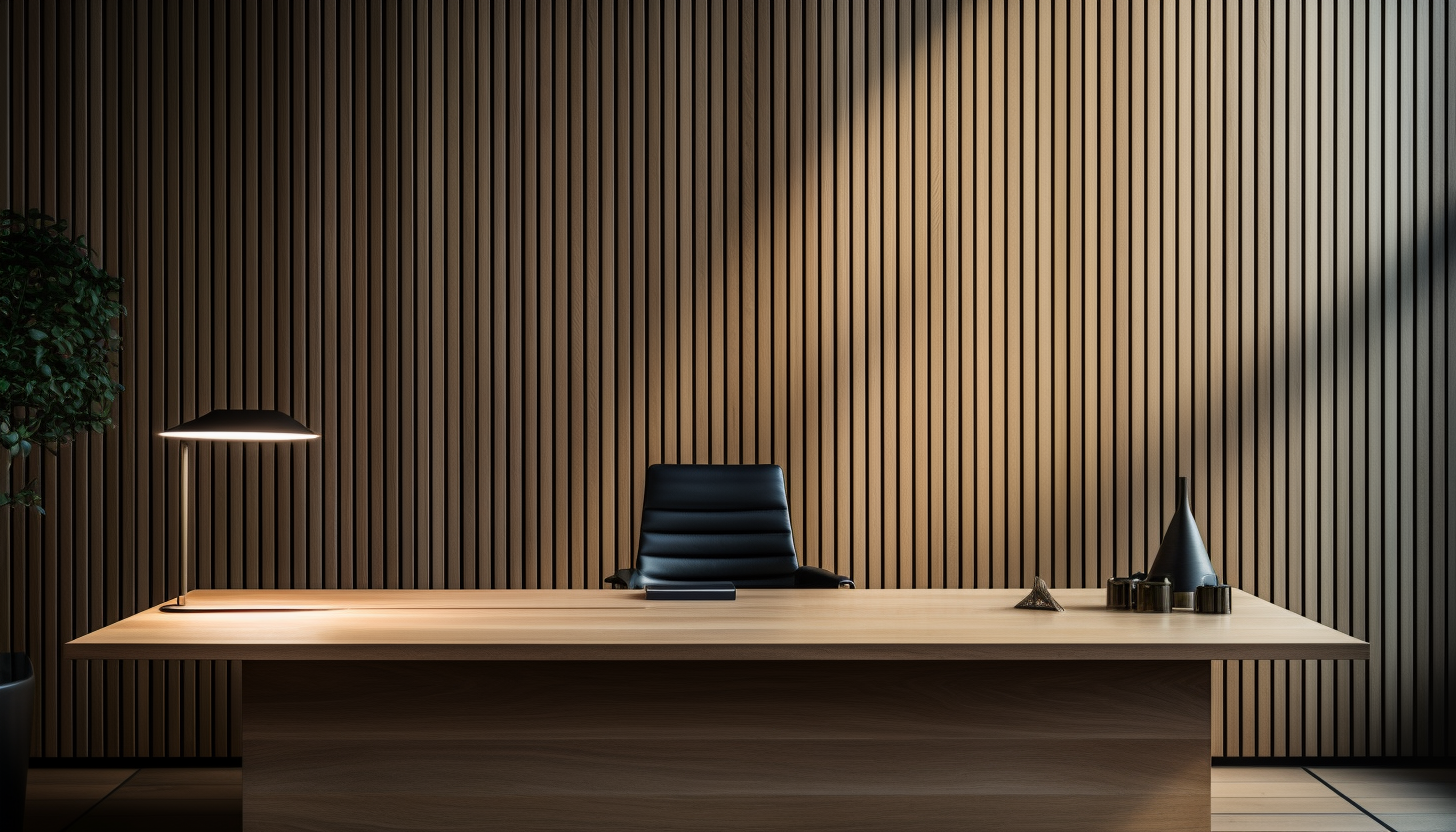
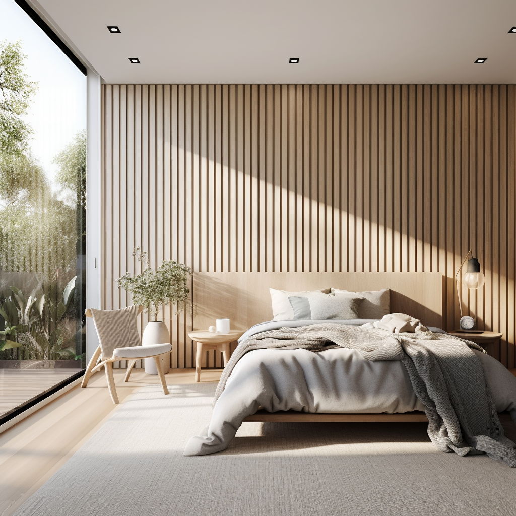
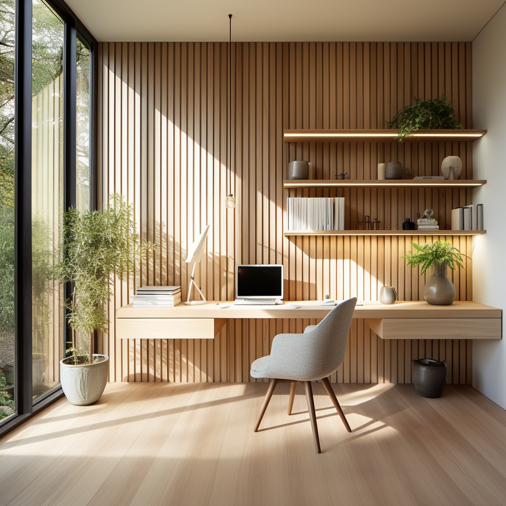
Natural Oak Wood Wall Panels
Natural oak wood panels often feature warm undertones with hints of yellow or red. This versatile wood type can be complemented by a variety of colors to enhance its natural beauty.
Neutral Tones:
Neutral colors like creamy whites, soft beiges, and light grays create a calm and cohesive backdrop for natural oak. These shades highlight the warmth of the wood without overpowering it. Consider pairing natural oak with:
- Creamy White: Enhances the light, airy feel of the space
- Soft Beige: Adds warmth and coziness, perfect for living rooms and bedrooms
- Light Gray: Offers a modern, sleek look that still feels inviting.
Bold Contrasts
For a more dramatic effect, use bold colors that contrast with the warm tones of oak. Deep, rich hues can add depth and character to your space.
- Deep Navy: Creates a sophisticated, elegant contrast.
- Forest Green: Adds a touch of nature-inspired vibrancy.
- Charcoal Gray: Offers a modern, industrial edge.
Earthy Tones:
Earthy colors harmonize well with natural oak, creating a grounded, organic feel. These shades enhance the wood’s natural beauty.
- Terracotta: Evokes a rustic, Mediterranean charm
- Olive Green: Lends a sophisticated, mid-century modern touch
- Muted Orange: Adds warmth and a subtle pop of color
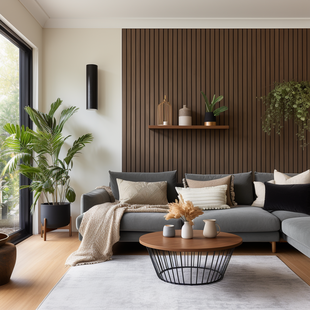
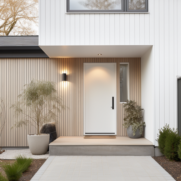
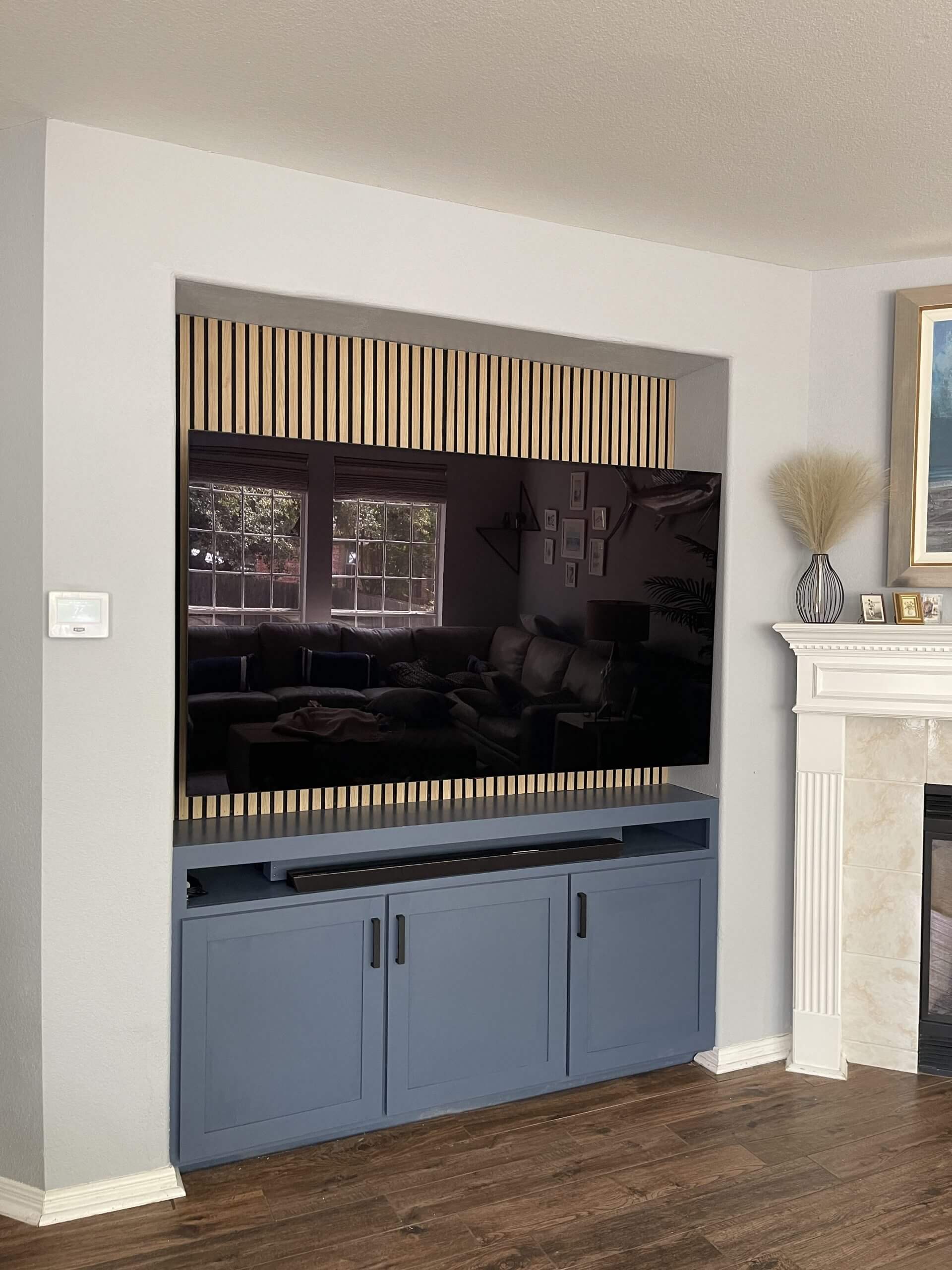
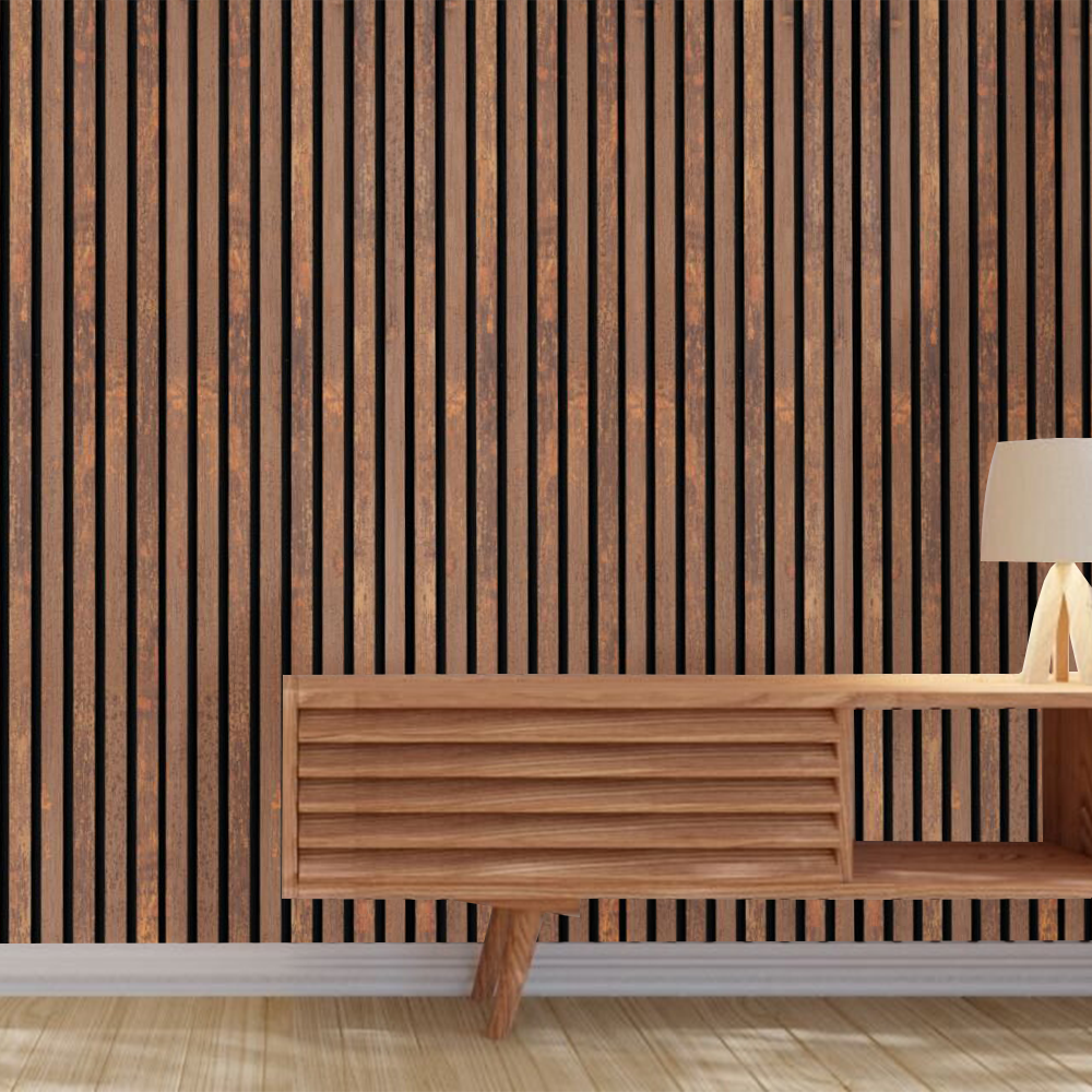
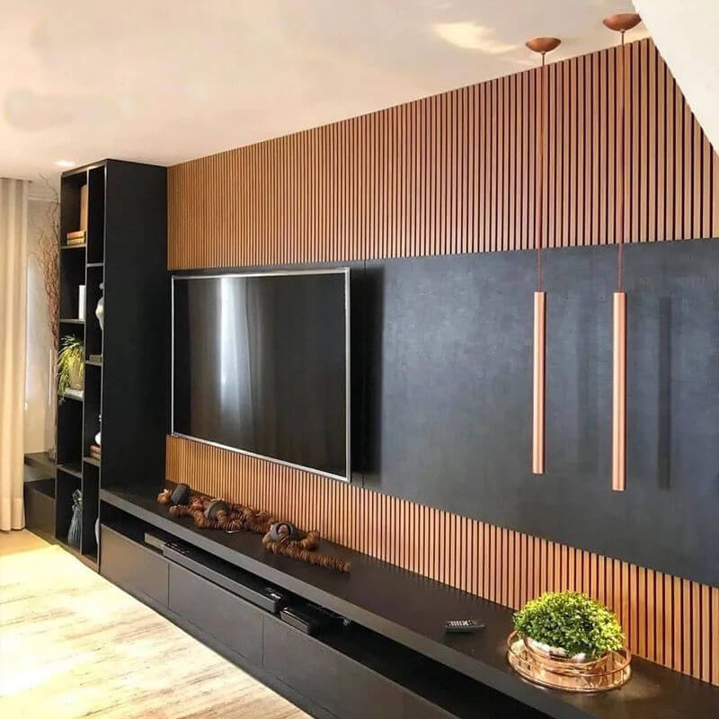
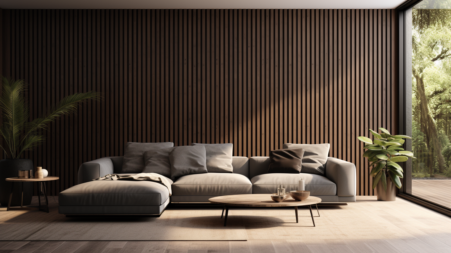
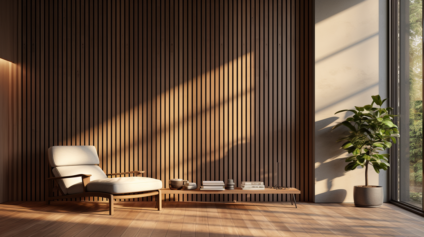
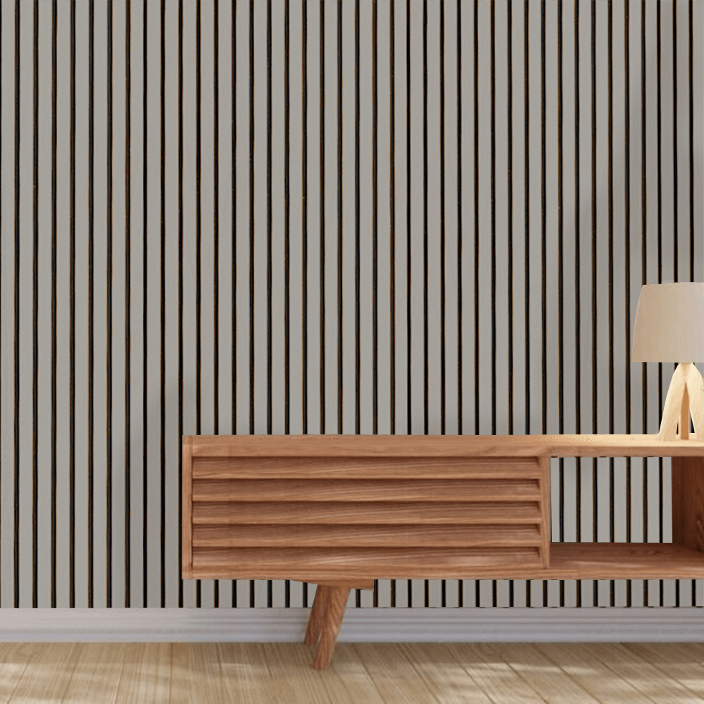
Natural Walnut Wood Wall Panels
Natural walnut wood panels are known for their rich, dark brown tones and cooler undertones. Choosing the right colors can highlight their elegance and add depth to your interiors.
Neutral Tones
Neutral colors provide a balanced backdrop that allows walnut’s natural richness to shine. Consider these shades:
- Crisp White: Creates a stark, modern contrast that highlights the wood’s dark beauty.
- Soft Gray: Complements the cooler undertones and adds a sophisticated touch.
- Warm Beige: Balances the darkness of walnut with a touch of warmth.
Bold Contrasts
Adding bold colors can make walnut panels stand out, creating a dynamic and vibrant space.
- Emerald Green: Enhances the richness of walnut and adds a luxurious feel.
- Burnt Orange: Provides a warm, complementary contrast that feels energetic.
- Royal Blue: Creates a striking and sophisticated look.
Analogous Colors
Analogous colors, those next to each other on the color wheel, can create a serene and harmonious atmosphere.
- Blue-Green: Evokes a tranquil, nature-inspired vibe.
- Teal: Adds depth and a modern touch.
- Soft Blue: Creates a calming, cohesive look.
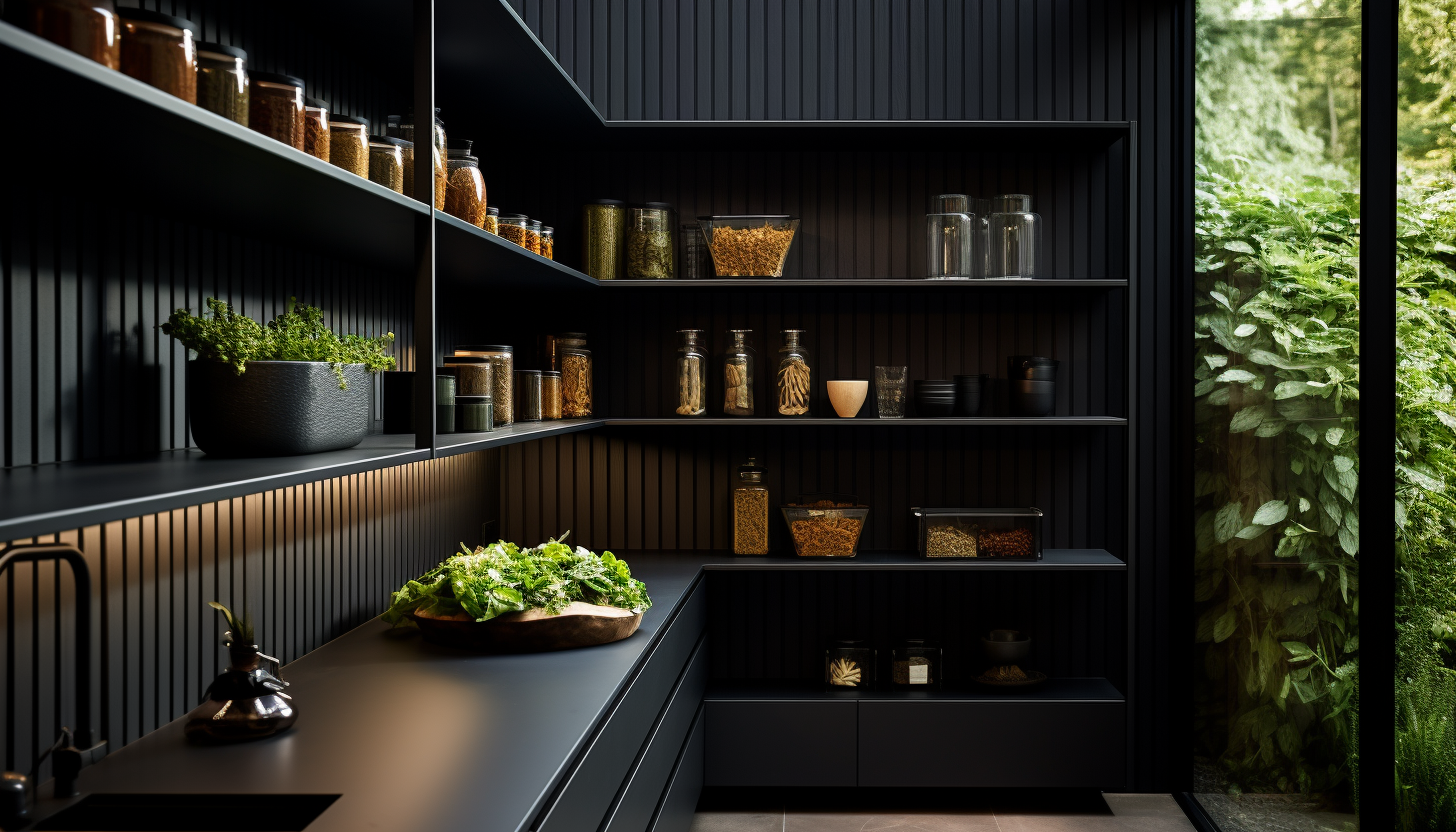
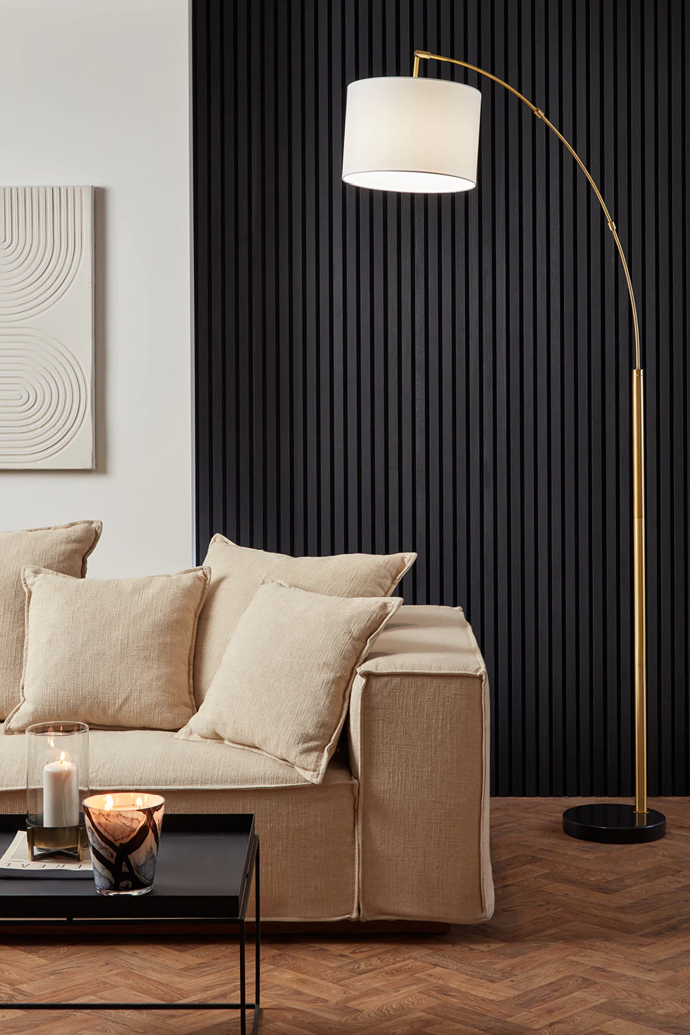
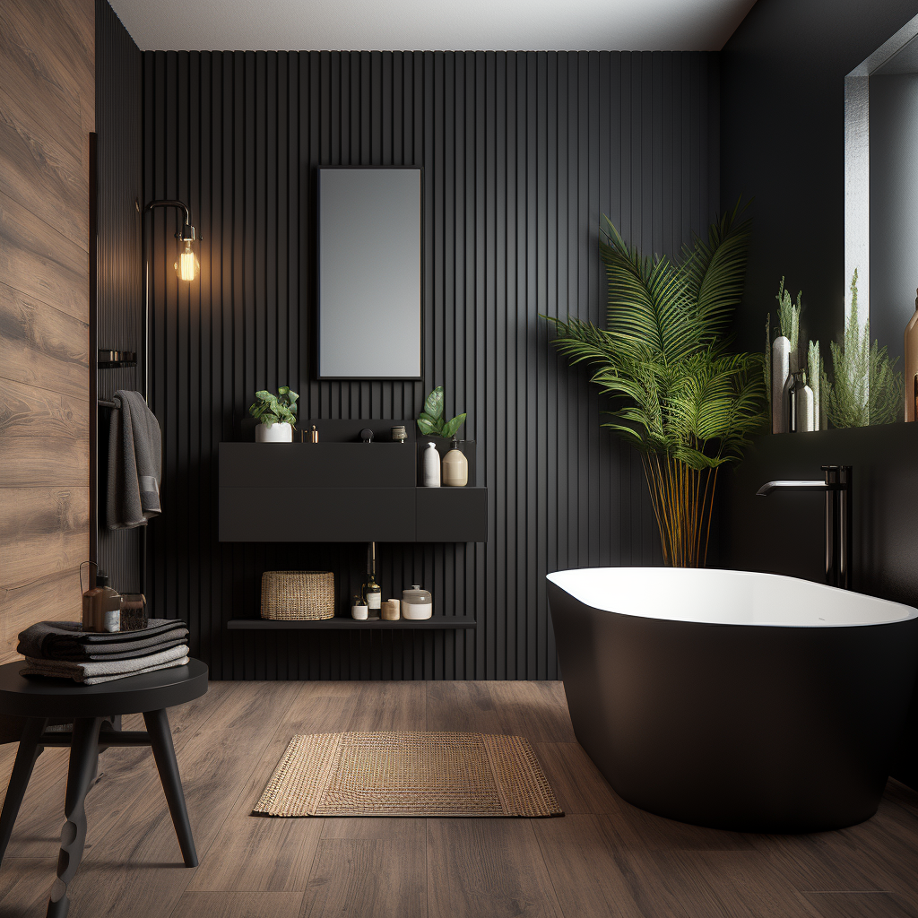
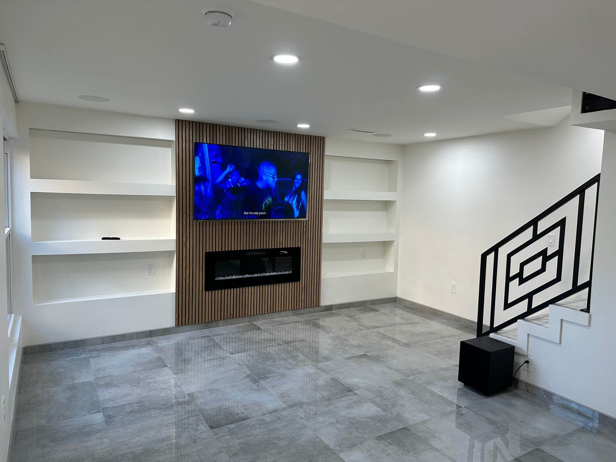
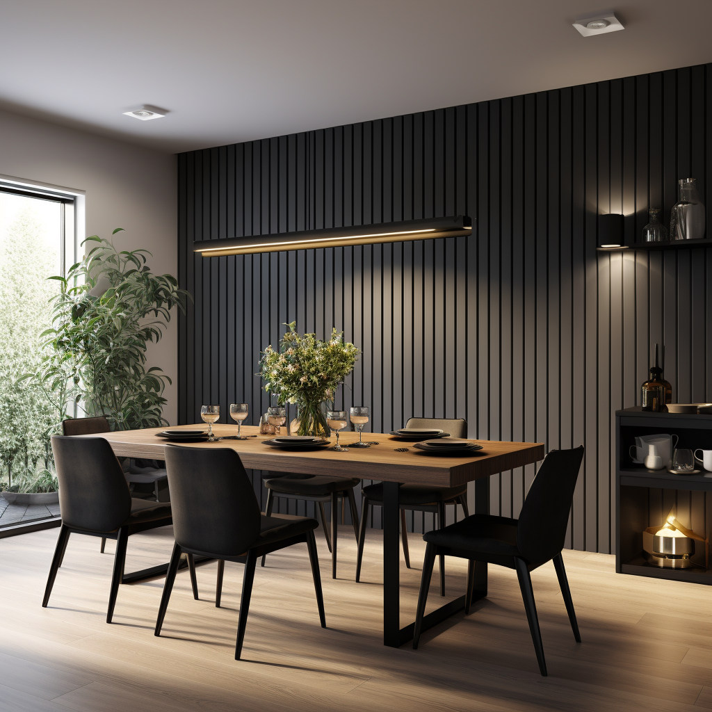
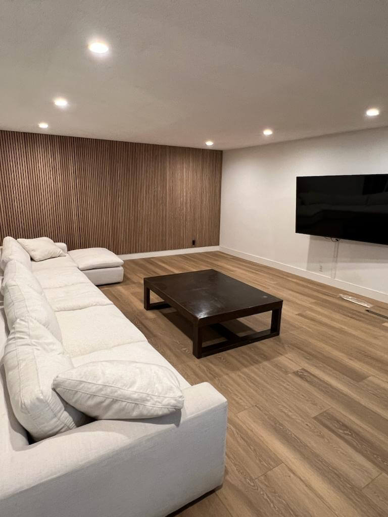
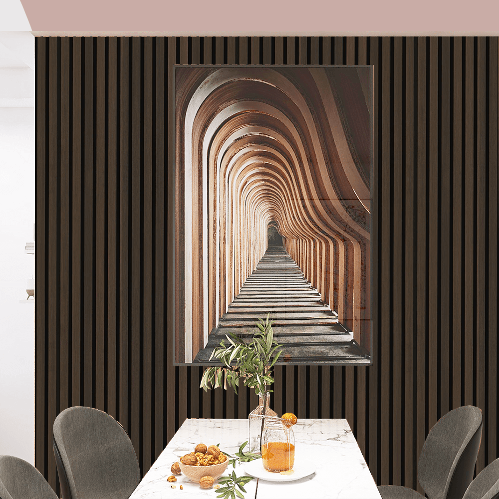
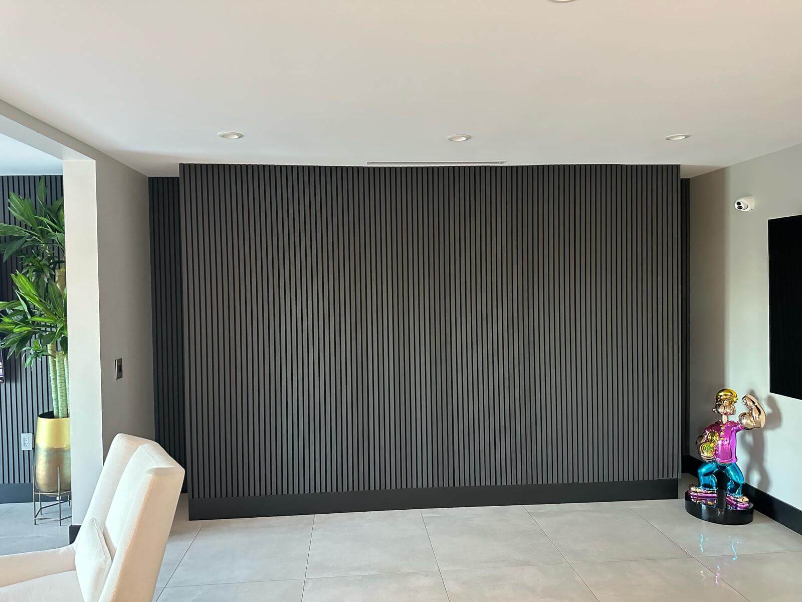
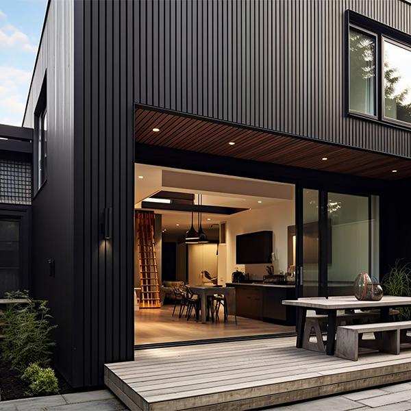
Dark Oak Wood Wall Panels
Dark oak wood panels are characterized by their deep, rich tones and can add a sense of luxury and sophistication to any space. The key is to balance their intensity with appropriate colors.
Light Neutrals
Light neutral colors can prevent a space with dark oak from feeling too heavy or dark.
- Pale Ivory: Offers a classic, elegant contrast
- Light Gray: Adds a modern, airy feel while maintaining sophistication
- Soft Beige: Warms up the space without overwhelming the dark oak
Warm Accents
Warm colors can create a cozy, inviting environment when paired with dark oak.
- Warm Red: Adds a touch of drama and elegance
- Golden Yellow: Brightens the space and adds warmth.
- Rust: Creates a rich, autumnal feel
Cool Complements
Cool colors can enhance the depth and richness of dark oak panels.
- Slate Blue: Provides a sophisticated, calming contrast.
- Cool Teal: Adds a pop of color that still feels elegant.
- Soft Green: Balances the dark tones with a touch of nature.
Choosing the right colors to complement natural wood wall panels involves a thoughtful balance of understanding undertones, experimenting with contrasts, and creating harmonious combinations to create your perfect vibe. Whether you prefer the understated elegance of neutral tones, the bold impact of complementary colors, or the organic charm of earthy shades, the right color palette can work to take your wood-paneled space to new heights of style and sophistication. The most important tip of all – embrace your creativity, and let the natural beauty of wood panels inspire your color choices, transforming your interiors into a beautiful, cohesive sanctuary.


